examstrack logo

You have a Tableau workbook that contain three worksheets named Sheet1 Sheet2 and Sheet3.
You create several filters.
From the Data Source page you plan to add data source fillers
When type of filter will appear in the Edit Data Source Filters dialog box?
A Data Analyst is creating a new data source made up of multiple tables and decides to use relationships during the creation process.
What is the advantage of using a relationship?
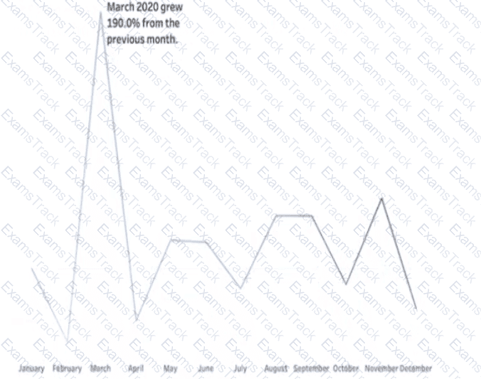
You have a line chart on a worksheet.
You want to add a comment to March 2020 as shown in the following visualization.
What should you do?
You have two tables named Employeelnfo and DepartmentInfo. Employeelnfo contains four fields named Full Name, Department ID, Start Date, and Salary.
DepartmentInfo contains four fields named Department Name, Size, Department ID, and VP.
You want to combine the tables to meet the following requirements:
. Each record in Employeelnfo must be retained in the combined table.
. The records must contain the Department Name, Size, and VP fields.
· Every record must have a full name.
Which type of join should you use?
You have the following tiled dashboard that has one sheet.
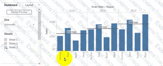
You want to replace the sheet with Sheet2.
What should you do?
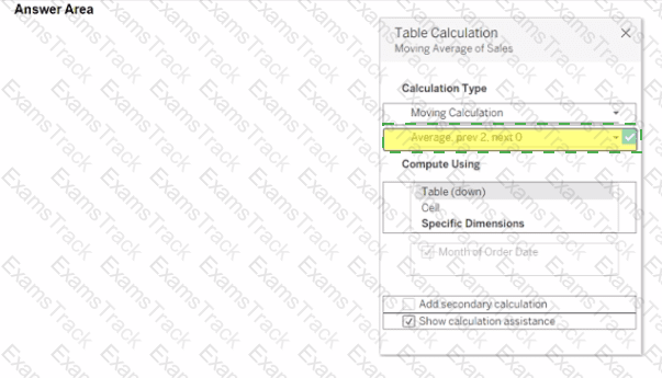
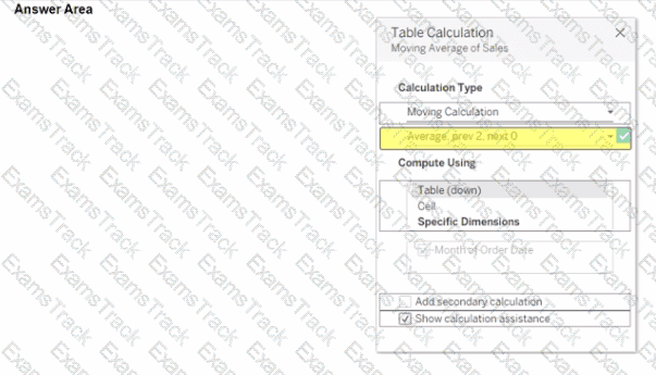
You use a quick table calculation lo calculate the moving average of a measure named Sales.
You need to calculate the moving averages of the last three years.
Which setting should you change in the Table Calculation dialog box? {Click the appropriate Option in the Answer Area)
Which type of visualization interaction can a Data Analyst achieve using set actions?
A Data Analyst is working with the following dataset.
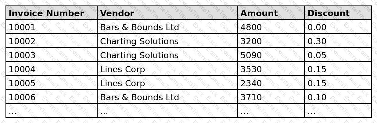
The analyst is trying to build a box plot showing the distribution of discounts offered to different vendors. The desired box plot and the analyst’s current result are shown below.
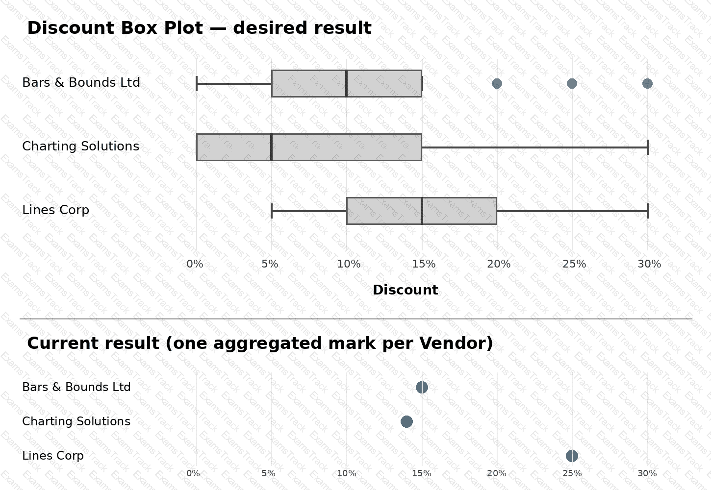
The analyst has dragged Vendor onto Rows and Discount onto Columns, added a reference line, and selected Box Plot without changing any default configuration settings.
Which action does the analyst need to take next to achieve the desired box plot?
You want to create the following dashboard.
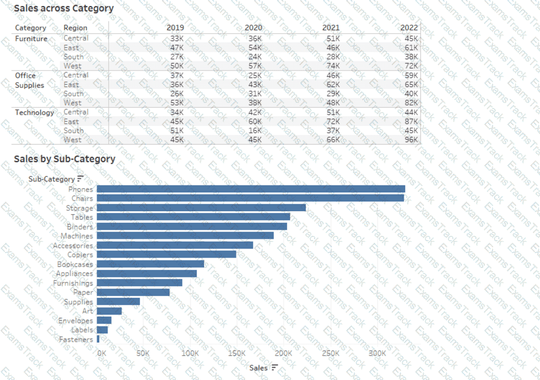
The dashboard will contain two sheets that will connect to the same data source. The top sheet will be configured to filter the bottom sheet.
When you click a category on the top sheet, the sheets must resize as shown in the following exhibit.
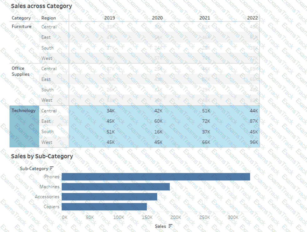
How should you lay out the objects on the dashboard?
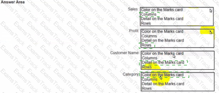
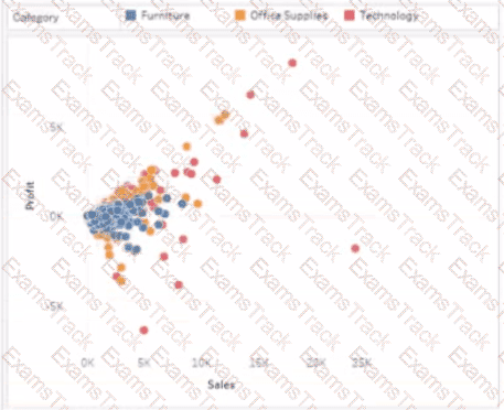
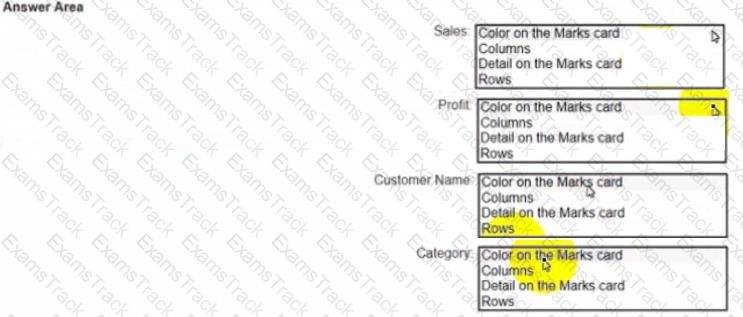
You have a dataset that has four fields named Category. Profit Sates and Customer Name. You need to create the following visualization.
|
PDF + Testing Engine
|
|---|
|
$41.25 |
|
Testing Engine
|
|---|
|
$31.25 |
|
PDF (Q&A)
|
|---|
|
$26.25 |
Salesforce Free Exams |
|---|

|

Copyright © 2026 Examstrack. All Rights Reserved

TESTED 18 Oct 2026